QUEER ART
LAYOUT & VOLUME DESIGN
In this project, I turned a Wikepedia article into an atypical booklet limited to the text and images used in this article.
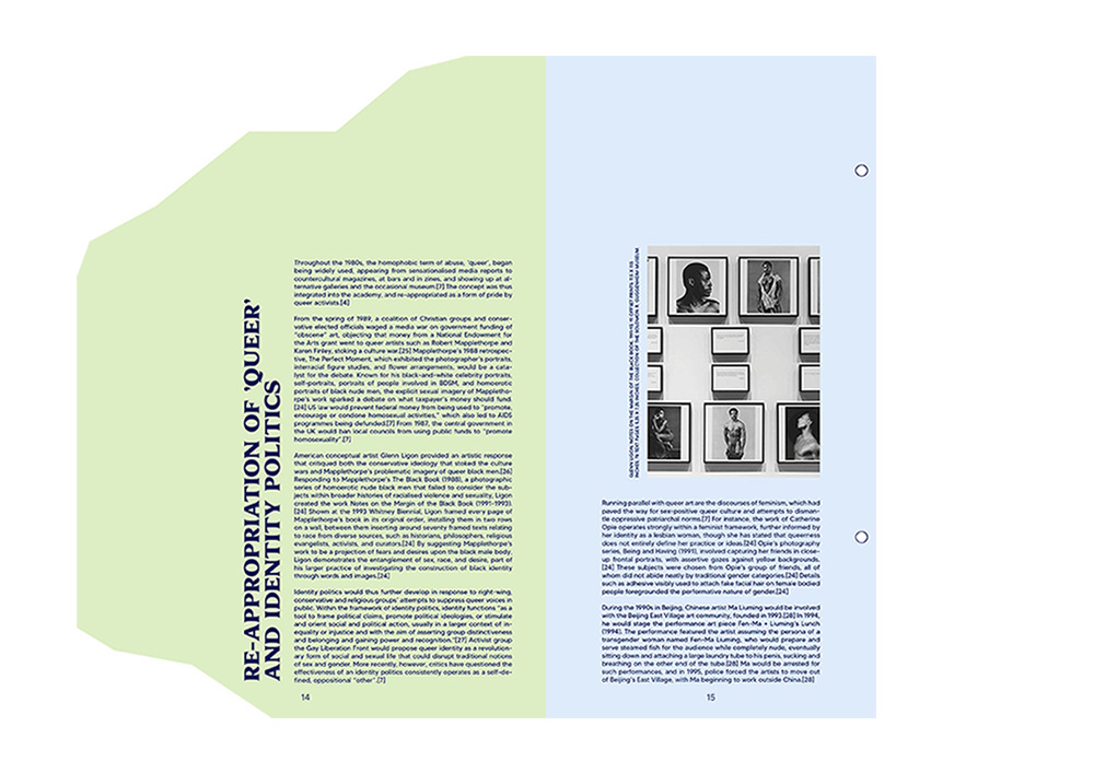
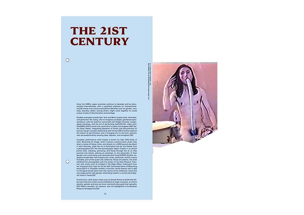
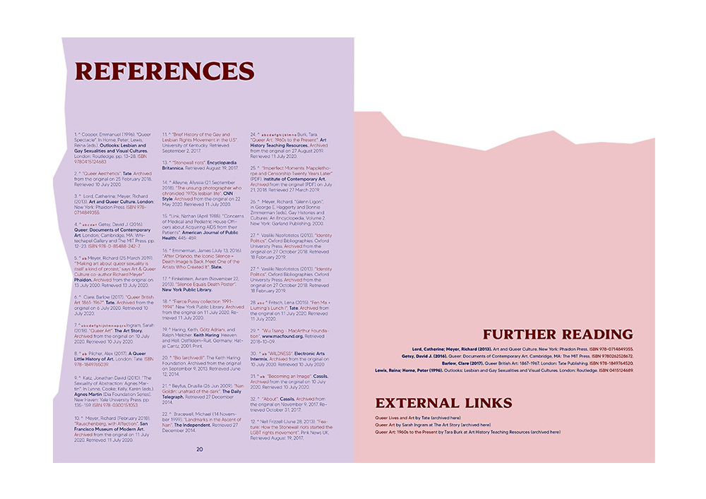
The idea of using different types of paper, sizes and torn sides (represented by white zigzags) serve to highlight the concept of “odd” “strange” and “weird” that comes with the word queer. It also embodies my idea of “history”. I wanted to showcase the struggles these artists went through, revolting against society in order to get to where we are today. In simpler terms, I wanted to show that these subtitles each came from a different sources (newspaper, magazine, books, etc.) and assembled in one booklet. The different colors of the pages represent the 6 colors of the LGBTQI+ flag and adds to the “strange” vibe of the booklet. It also emphasizes on variety. The color of the title text (dark red) represents AIDs that was mostly common in the gay community during this century and represented one of their greatest struggles.


